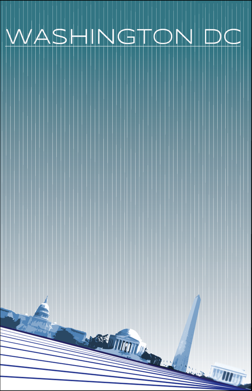
I LIKED THE PROJECT WHERE WE DESIGNED THE POSTER FOR THE CITY BECAUSE IT GAVE ME FREEDOM TO DO WHAT I WANTED. THE MOST VALUABLE INFORMATION I LEARNED WAS VISUAL HEIARCHY BECAUSE IT SETS ARTWORK APART FROM A BORING ARTWORK. I WILL REMEMBER MAKING ARTWORK AND HAVING A GOOD TIME.
|
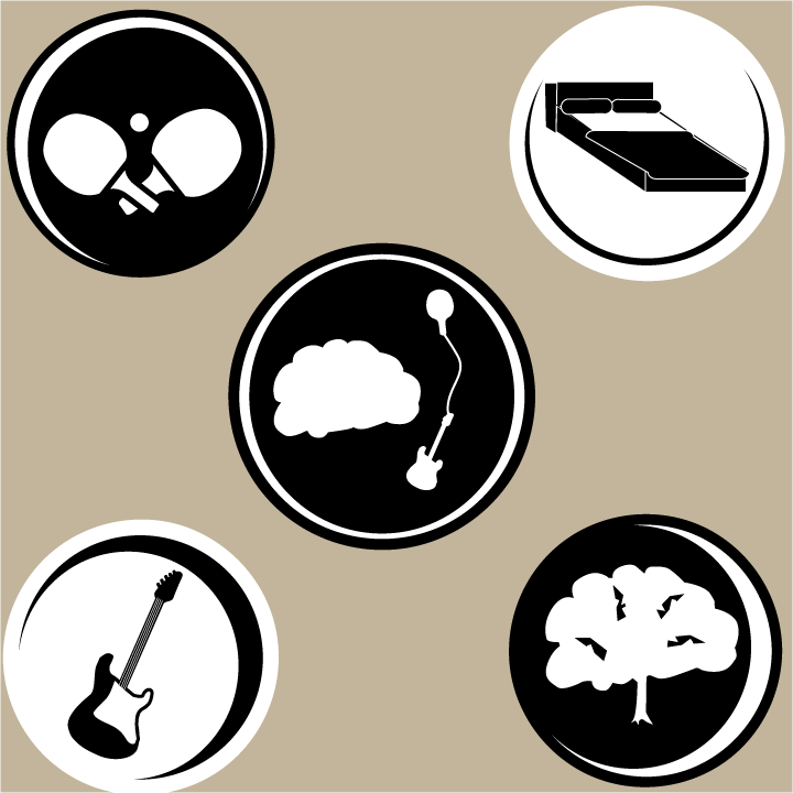
The first project was from MP1 and was a logo project that was supposed to represent things I like to do. I like this project because the simplicity of the logos. I took the idea of making the circle parts of the logos uneven from my previous project. I also used black and white differently in each circle which I liked. I think this was different from the other projects in my class because of the black and white and the circles surrounding each logo. I learned to use simplicity in my projects from this. This was deffinately not my favorite project but I learned a lot from it.
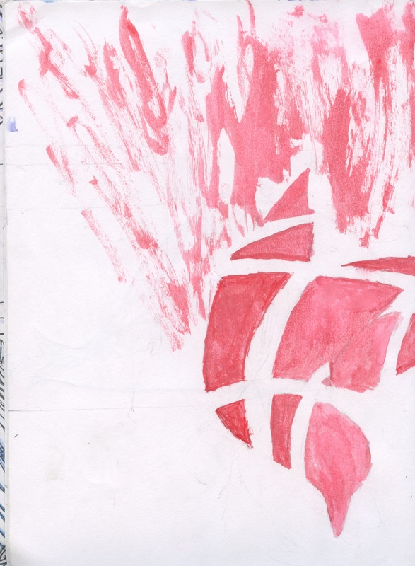
The second page of my project is from my sketchbook. I like this project because the way I made it and because it is a new way to paint for me. This is just a red bird with lines going across it and the paint splatter is to show movement. I don't like to use water colors because they are messy but I decided to try to use it for this; I liked the result. I made this the night before the sketchbook was due so I wanted to make something simple and something that uses one color. I was originally making the bird but then I decided to put stripes across it by leaving some spaces out of the paint. I accidentally smudged the end of the bird and then I realized it looked like the bird was moving. I also tried to use shading by adding more pain at bottom of the bird so it is darker. I think the main improvement is that I it is more simple. The first project was from the beginning of Advanced Design. I only knew about the things I learned in Computer Art 1. During Computer Art 1, I did not practice that much symmetry. I also was not aware of how much detail affects art. Prior to Advanced Design, I did not know how to effectively use contrast and placement to make a design look more interesting.
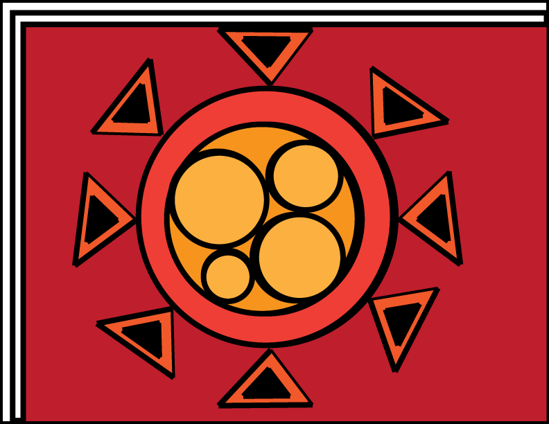
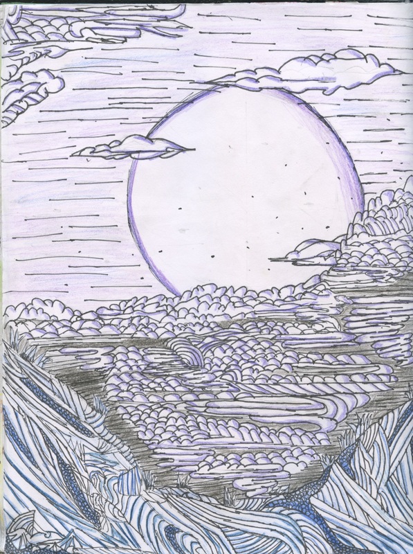
I learned that I don't have to use many different colors to make something look interesting. A few similar colors look more smooth and use contrast more effectively than using different colors. On the second design I tilted the main buildings which made it look interesting, added movement, and added action. Instead of making the background a solid color like the first one, I added thin lines that split at many areas which also showed movement. My biggest improvement was using asymmetry which was also the most significant item I learned. This sketchbook page took the most time out of all of my sketchbook pages. I like this page because I never tried to use this type of drawing before, so it was experimental (luckily not an experiment that went wrong). I used 4 colors; dark purple, light purple, turquoise, and blue. First I drew everything in pencils, then I used a sharpie pen to outline the pencil, and I erased the pencil. It uses a completely new design compared to the rest of the pages. This page used asymmetry and I tried to use colors that would go together smoothly. Other people seemed to like it as well. I got many comments that said it looked like Asian art form. |
 RSS Feed
